Why Do Outdoor Rugs Look Different in Person Than Online?
TL;DR: Why do outdoor rugs look different in person than online? Three things stack up — product photos use warm studio lighting that flatters beiges, your screen adds its own color cast, and budget polypropylene often carries a cool gray undertone the editing hid. So a rug photographs warm sand and arrives flat gray. The fix is buying warmth that’s woven in, not photographed in: the Nourison Positano ($60.27, 4.5 stars across 549 reviews) is the pick reviewers say actually arrives the color it looked.
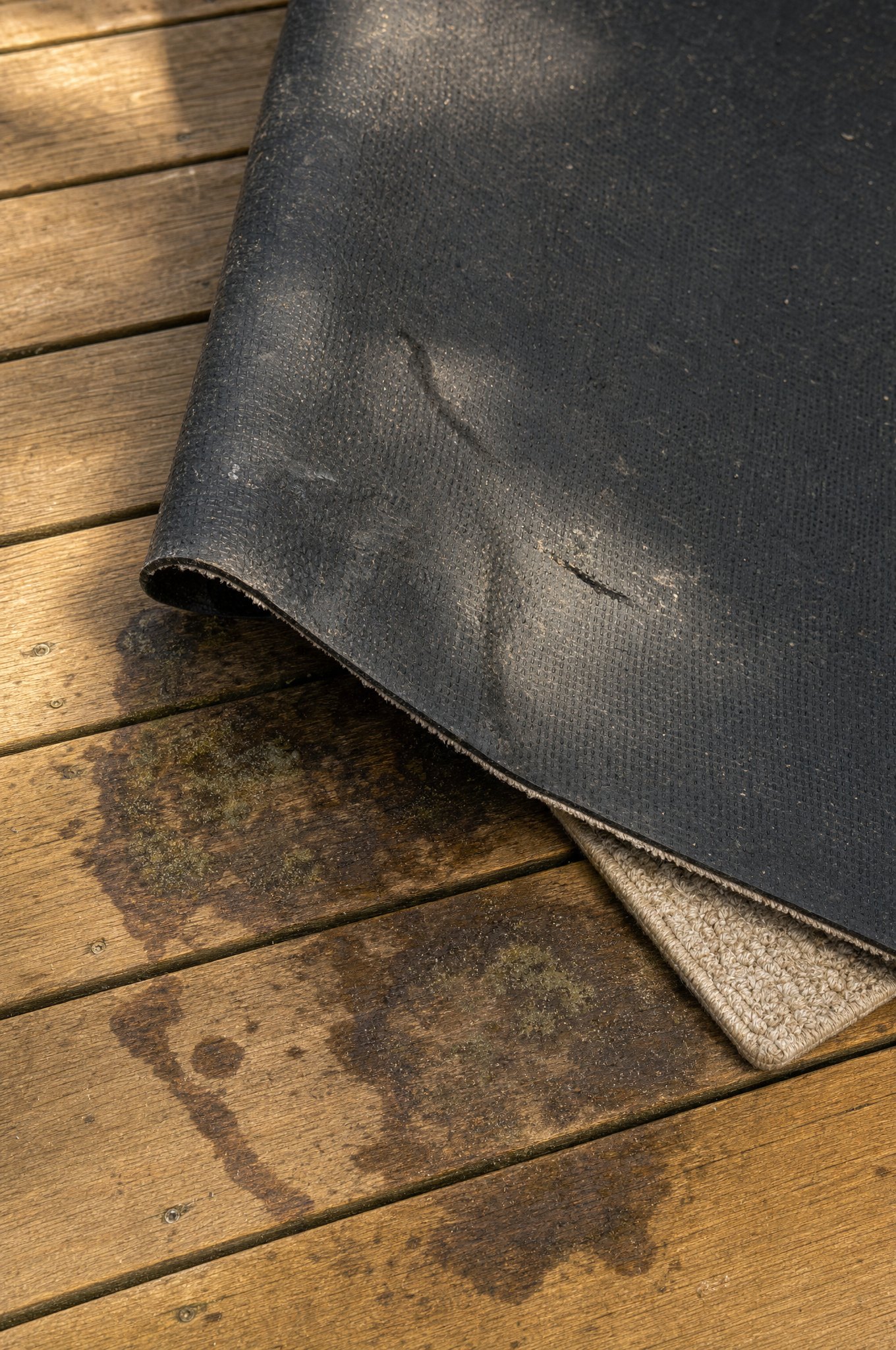
Your rug didn’t lie to you — the lighting did. Outdoor rug listings are shot under warm studio lights that flatter every beige and cream, then your screen layers on its own color temperature, and budget polypropylene often hides a cool gray undertone underneath. Stack those three and a rug that looked warm sand online shows up flat gray-tan on your patio.
The good news: it’s predictable, which means it’s avoidable. Here’s what’s really happening and how to buy a rug that arrives the color you saw.
Why Does a Rug Photograph Warmer Than It Arrives?
Product photography is a styling job, not a documentary. Three forces push the on-screen color away from reality:
- Studio lighting runs warm. Catalog shots use warm, even light that makes beiges glow like golden hour. Your overcast Tuesday balcony is cooler light, so the same rug reads grayer.
- Screens aren’t calibrated. Your phone and laptop each render color slightly differently. A rug tuned to look perfect on the photographer’s monitor can shift on yours before it ever ships.
- Editing flatters the fiber. Budget polypropylene can carry a cool undertone. Light editing warms it for the listing; real daylight strips that warmth right back out.
None of this is fraud — it’s the standard gap between a styled shot and a real room. As Wirecutter’s outdoor rug testing repeatedly finds, the rugs that disappoint on arrival are usually the cheap solids most sensitive to this shift, not the mislabeled ones.
Which Rugs Actually Arrive the Color They Look?
The trick is warmth that’s woven in, not added in post. When the warm tone comes from the actual fiber blend, there’s nothing for daylight to strip away.
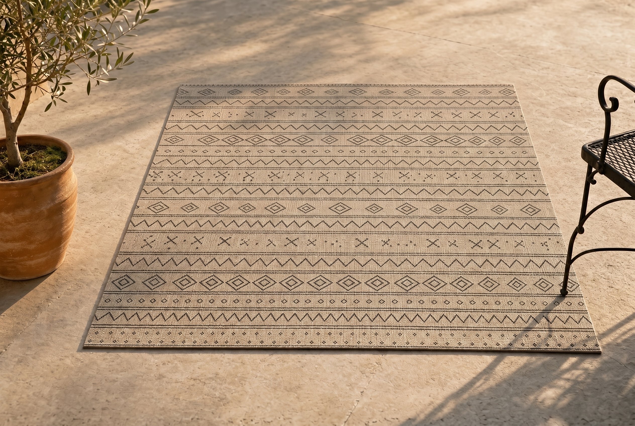
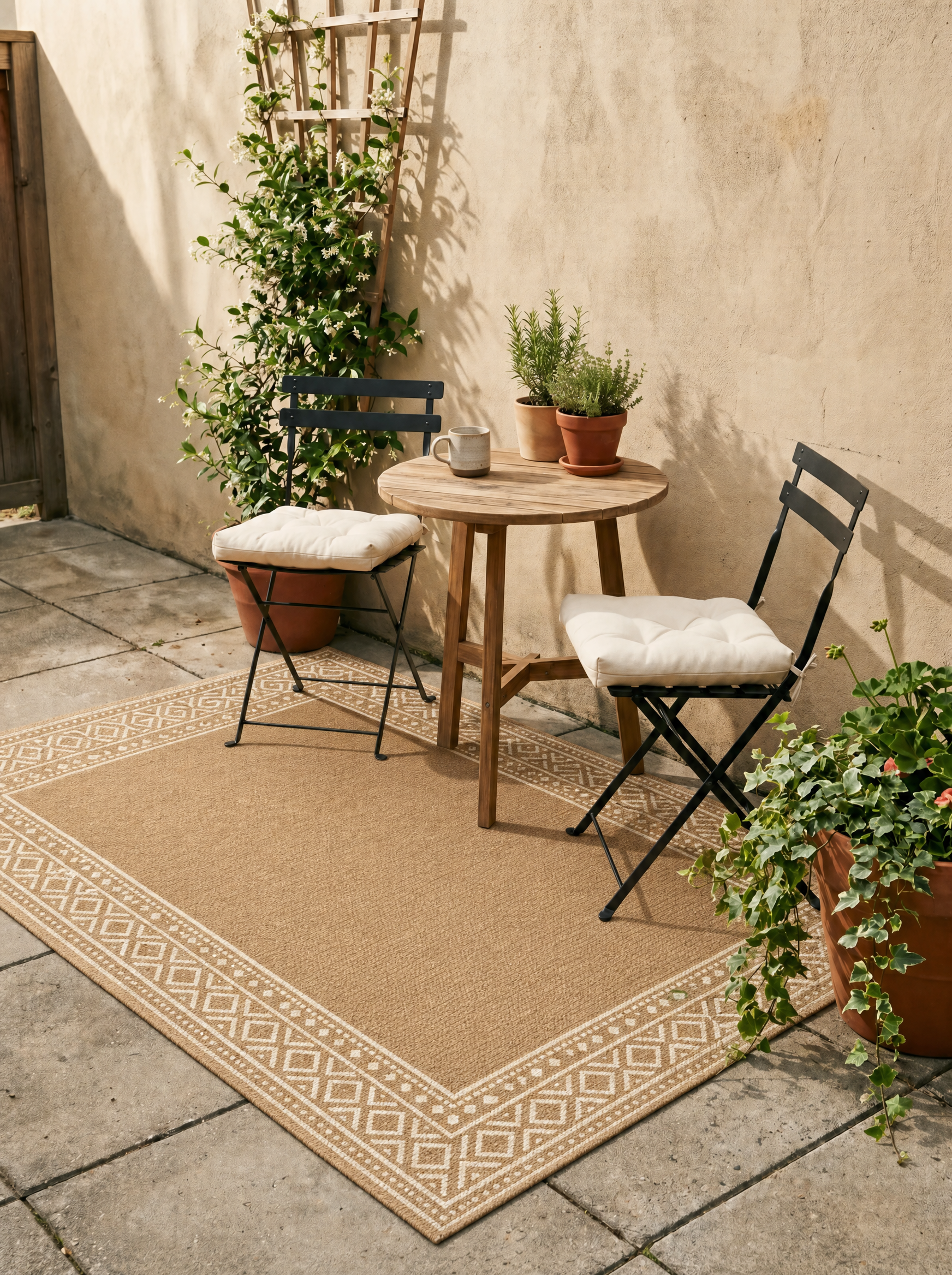
The Nourison Positano is the rug reviewers single out for exactly this. It reads warm sand on concrete instead of the weird gray-tan that plagues budget beiges, because the warmth is in the weave — 80% polypropylene, 20% polyester at $60.27, 4.5 stars across 549 reviews. It’s the “arrived the color I saw” pick, and the reason it survives the studio-to-patio shift that sinks cheaper solids.
Styled lifestyle image. Click through to view current Amazon product photos and pricing.
Nourison Home Positano Natural 5' x 7' Area Rug - Easy Clean, Non Shedding, Bed Room, Living Room, Dining Room, Kitchen (5' x 7')
Best for: Small balconies and budget-conscious renters
$60.27
View on AmazonWhy Are Patterns Safer Than Solids for Color?
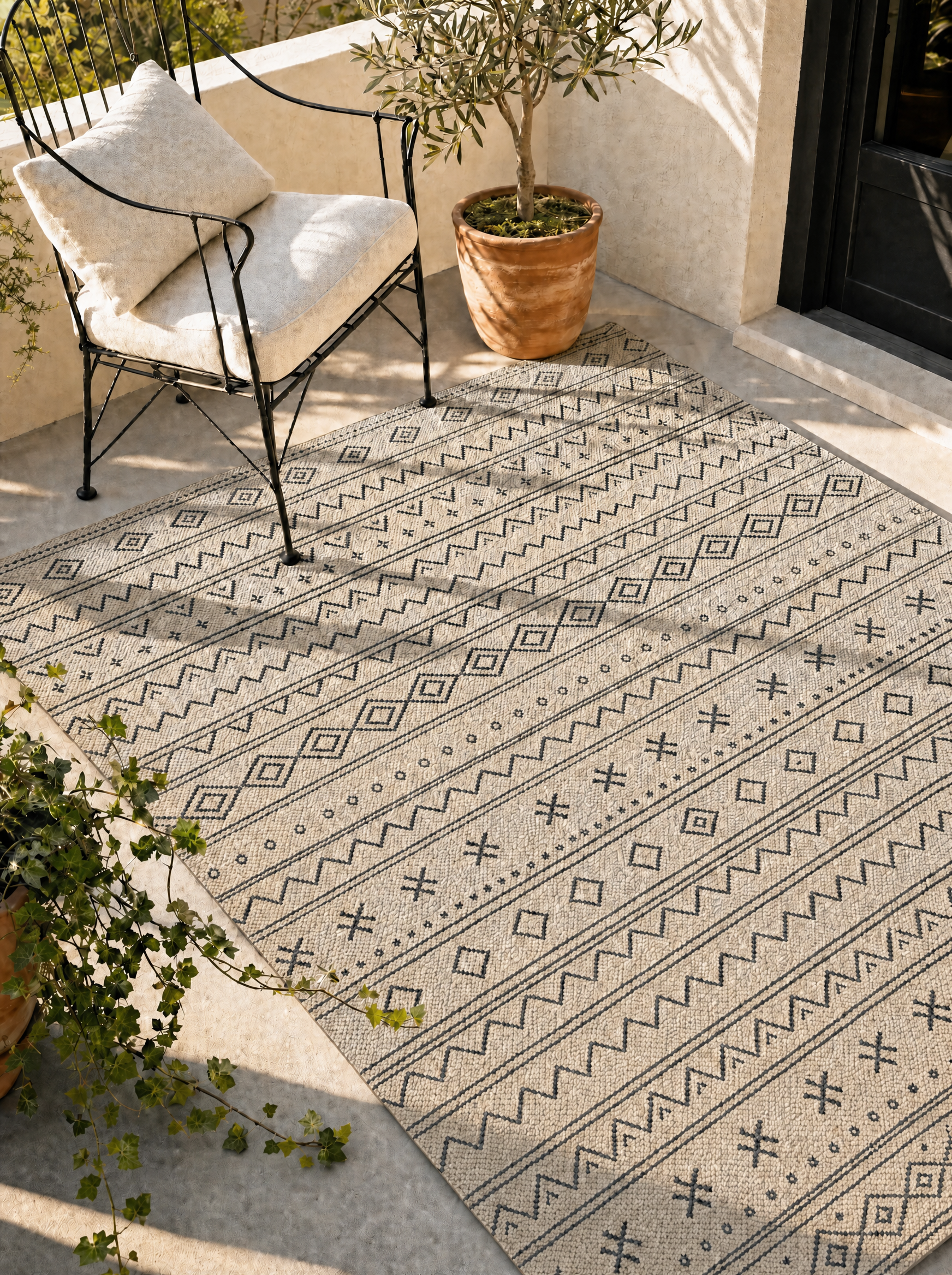
A pattern hides a color shift; a flat solid broadcasts it. On a solid, every fiber is the same tone, so a slight cool shift turns the whole rug gray at once. On a pattern, your eye reads a mix of colors, so a small shift in any one of them barely registers.
The JONATHAN Y Moroccan geometric is the low-risk color buy for this reason — a soft diamond pattern at $70, 4.7 stars across 5,857 reviews, where the pattern does the color forgiveness for you. If you’ve been burned by a beige that arrived gray, switching to a low-contrast pattern is the simplest insurance you can buy.
Styled lifestyle image. Click through to view current Amazon product photos and pricing.
JONATHAN Y Moroccan Geometric Indoor/Outdoor Area Rug 5' x 8', Natural/Black, Ourika Textured Weave
Best for: Designer look at a non-designer price
$70.00
View on AmazonWhat About Budget Rugs — Do They All Shift?
Not all, but budget is where color accuracy gets riskiest, so buy on evidence. The GENIMO Boho Geometric is the value pick that earns its color trust through volume: 4.2 stars across 2,270 reviews at $41.39, with a patterned weave that, like the JONATHAN Y, hides shift better than a flat budget solid would.
The budget rugs to avoid are the $25 single-tone beiges and bright whites — they carry the most undertone and shift coolest in daylight. If you want a budget solid, the renter-friendly picks chosen for color reliability are a safer hunting ground than a bargain-bin mat.
Styled lifestyle image. Click through to view current Amazon product photos and pricing.
GENIMO Outdoor Patio Rug - Boho Geometric (5' x 8')
Best for: High-traffic patios on a tight budget
$41.39
View on AmazonWhy Do Whites and Grays Shift the Most?
If you’ve been burned by a color shift, odds are the rug was a bright white, a cool gray, or a flat single-tone beige — the three most screen-sensitive colors there are.
Bright whites have nowhere to go but down: any ambient color cast in your space tints them, so a crisp studio white reads cream indoors and dingy gray on an overcast patio. Cool grays amplify their own undertone in shade, which is why a “modern greige” can arrive looking like wet concrete. And flat single-tone beiges sit right on the warm-cool knife edge, so a few degrees of color temperature decides whether they read sand or ash.
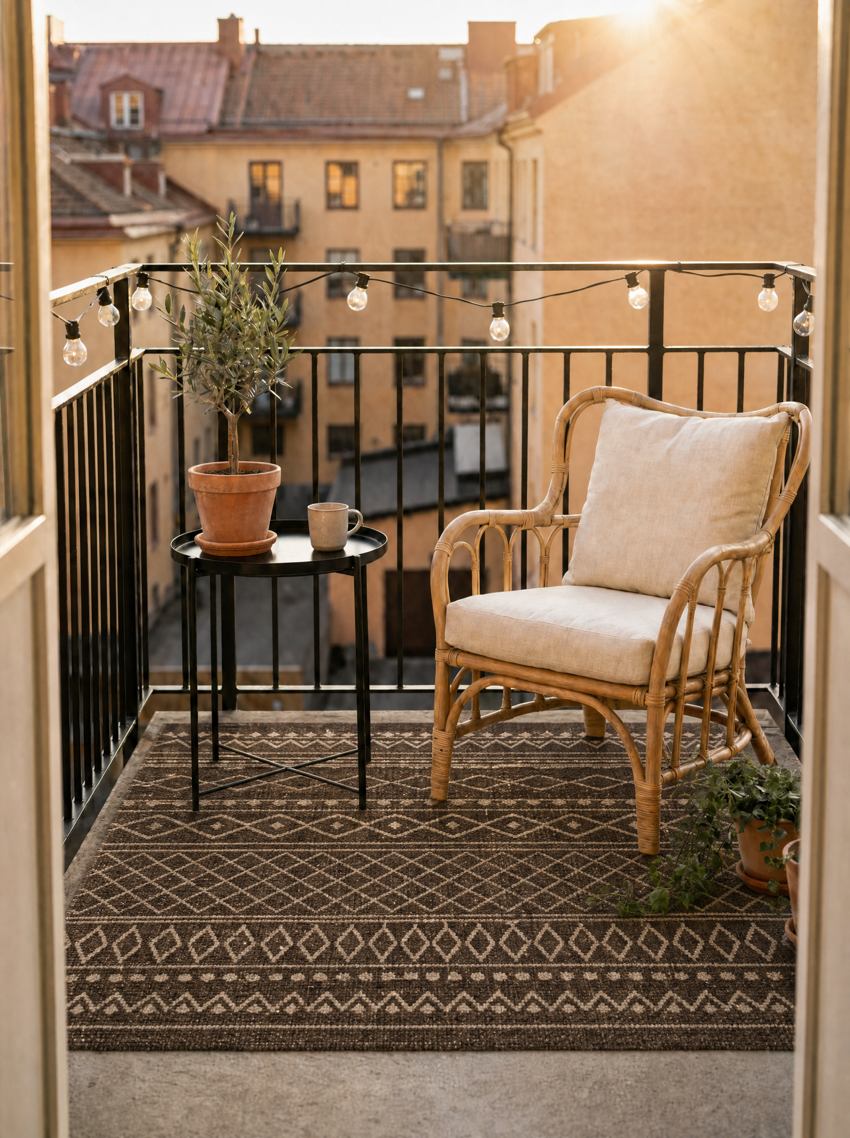
Warm naturals, heathered blends, and patterns are the safe end of the spectrum. The warmth or the color mix is built into the fiber, so there’s a floor below which they can’t shift. If color accuracy is your top worry, simply avoiding bright white and flat cool-gray solids eliminates most of the heartbreak before you even compare brands. It’s the easiest rule on this page: the more uniform and the cooler the color, the more it will move between screen and patio.
Does the Weave Affect How Color Reads?
More than people expect. Two rugs in the identical dye can read as different colors because the weave changes how light bounces off the surface.
A high-sheen, flat weave reflects light directly back, which washes out the color and exaggerates any cool cast — part of why cheap glossy polypropylene looks both plastic and grayer than its photo. A matte, textured, or higher-twist weave scatters light, which deepens the color and reads warmer and richer. So the same beige is warmer in a heathered flatweave than in a slick budget mat, before you even get to the dye itself.
This is why the texture of a rug and its color accuracy are really the same conversation: the construction that kills the plastic look also stabilizes the color. When you’re choosing between two rugs in the same shade, the one with visible weave texture will almost always arrive closer to its photo than the slick flat one. Buy the texture and you tend to get the color for free.
Can You Trust Buyer Review Photos?
They’re the most trustworthy color source on the page — with one caveat. Review photos are shot in real homes under real, uncontrolled light, which is exactly the condition you’re buying for. A studio shot shows you the rug’s best-case lighting; a stack of review photos shows you its average.
The caveat: phone cameras and uploads compress and auto-correct color too, so no single review photo is gospel. The signal is in the pattern across many. If ten review photos all lean warmer or cooler than the listing’s hero shot, believe the ten. If they’re all over the place, the rug is probably color-stable and you’re seeing different rooms, not different rugs.
Sort reviews by “with images” first, then read the written ones for color words specifically. “Exactly as pictured,” “warmer than expected,” and “more gray in person” are the phrases that tell you what will actually land on your patio. A rug with dozens of review photos that match each other — like the higher-volume picks here — is a far safer color bet than a beautiful listing with three studio shots and no real-room evidence at all.
Why Does the Same Rug Look Different on Two of Your Own Screens?
Because no two screens are calibrated the same, and most aren’t calibrated at all. Your phone runs warmer than your laptop; your laptop in night mode shifts everything amber; an OLED phone saturates color a budget monitor mutes. The rug never changed — the glass in front of it did.
This is why “I looked at it on my phone and it seemed fine” isn’t reliable. If color really matters, look at the listing on more than one device and in more than one room’s light before you commit, and weight the buyer review photos over any single screen’s rendering. The takeaway is humbling but useful: the rug’s “true” color isn’t fully knowable from a screen at all, which is exactly why woven-in warmth and real review evidence beat trusting the picture. When you stop trusting any one screen, you start buying the rug instead of the photo.
How to Buy the Right Color the First Time
Five checks that beat the studio shot:
1. Find the buyer review photos. Real homes, real light — the single most honest color source on the page. Sort reviews for image uploads first.
2. Read reviews for the word “gray.” Color complaints surface fast. “More gray than pictured” in three reviews is a reliable warning.
3. Look for multiple lighting shots. A listing that shows the rug in bright and shaded light is showing you the real range. One perfect overhead frame is hiding it.
4. Prefer warmth that’s woven in. Heathered and warm-natural fibers hold their tone. Flat single-tone beiges shift coolest.
5. When unsure, pick the pattern. A low-contrast geometric forgives a color shift a solid can’t.
Do those, and the rug on your patio matches the one on your screen — which, after the gray-beige heartbreak, is the whole point.
Related reading
Got questions?
Why did my outdoor rug arrive a different color than the photo?
Three forces stack up: product photos are shot in warm studio lighting that flatters beiges and creams, your screen adds its own color temperature, and budget polypropylene can carry a cool gray undertone the photo editing softened. Together they make a rug photograph warm sand and arrive flat gray-tan. It's rarely a mislabeled product — it's the gap between a styled studio shot and your actual patio light.
How do I know a rug's true color before buying?
Skip the hero shot and hunt for reality: look for listings with multiple photos in different lighting, zoom for fiber-level color, and read reviews specifically for color complaints — 'more gray than pictured' shows up fast when it's a problem. Buyer review photos are the single most honest source, because they're shot in real homes under real light, not a studio.
What outdoor rug colors are most accurate online?
Warm naturals and true patterns travel best. A heathered or genuinely warm-sand beige like the Nourison Positano holds its tone because the warmth is woven in, not added by the photographer. The colors that disappoint most are flat single-tone beiges and bright whites, which pick up the most cast from screens and shift coolest in real daylight.
Does lighting really change how a rug looks that much?
Yes — dramatically. The same rug reads warm under morning sun, cooler under overcast sky, and grayer in shade. A product shot lit with warm studio lights is closer to your best-case golden-hour look than your average cloudy afternoon. That's why a rug can look perfect in the listing and flat on your north-facing balcony: you're seeing it under worse light than the photographer used.
Are warm-beige outdoor rugs worth it or do they all turn gray?
They're worth it if the warmth is in the fiber, not the photo. The Nourison Positano is the example reviewers single out for arriving warm sand rather than the cheap gray that plagues budget beiges — 4.5 stars across 549 reviews. The ones that 'turn gray' were never truly warm; they were cool rugs photographed warm. Buy on reviews, not the studio shot.
Can I return an outdoor rug if the color is wrong?
Usually yes within the retailer's window, but save yourself the round trip: order from listings with real-room review photos and a warm-by-construction fiber. If you're unsure between two, the patterned option (like the JONATHAN Y Moroccan) is the safer color bet — a pattern's color reads as a mix, so a slight shift is far less noticeable than on a flat solid.
Written by KORP
Covering home decor for people who actually care how their space looks — outdoor patios, small rooms, and the details that make it feel intentional.